Peter Saville is the kind of designer people build legends around. For the past two decades he has been making work that excites us in unique and surprising ways. Most know him through his designs for the record industry, but his new projects extend his wit and style far beyond that arena, with work that few of us have had a chance to see. AIGA NY was happy to have Peter as the first speaker of the 2001-2002 season.
by Alice Twemlow
An incisive cultural commentator. A design superstar. An
international playboy with a London Mayfair apartment to match.
A consistently unconventional, nomadic intellectual. A renaissance
man with bad work habits. Descriptions like these precede
Peter Saville like clouds before a storm.
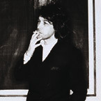
I meet him in the afternoon, which is fortunate because, true
to form, the notoriously nocturnal Saville greets me in a
silk dressing gown after a hard night's work on the latest
Hugo Boss campaign. His glamorous lifestyle/workstyle and
his immaculately renovated 1970's mansion block apartment
have been the subject of almost as much media interest as
his creative output. This would not be a surprise if Saville
were a film star (as the somewhat autobiographical cover he
designed for the Suede single of the same name--featuring
a photo of Saville himself dressed as a clubgirl--suggests).
But the graphic design profession is rarely thought of in
such glamorous terms. Still, Saville is not likely to be hindered
by convention.
"I've no interest in graphic design"
Once he is dressed for the day--what is left of it, anyway--in
a distinctly Saville-esque uniform of white jeans and black
turtleneck sweater, and we are seated in a high-ceilinged
room that looks like the set for a luxurious fashion shoot,
the loquacious Saville begins to talk. "I've no interest
in graphic design," he says, head in hand, with a world-weary
sigh--the first of many that will punctuate descriptions of
his spiritual and vocational journey from Manchester to Mayfair.
His conversational style is urbane, considered and multilinear.
He keeps several lines of thought spinning simultaneously
and manages to respond to urgent telephone inquiries (one
requests his presence at Pulp's This Is Hardcore album launch
party that very night), while providing an informed running
commentary on the England v. Switzerland football match that
is unfolding silently on a television screen. All the while,
like a holdover from an Antonioni move, he elegantly chain-smokes
French cigarettes. "The cultural significance of a graphic
problem is interesting--whether it's about the state of the
world that's created the issue in the first place or about
how the issue is going to affect the state of the world--but
the actual craft of graphic design doesn't interest me,"
Saville says, relaxing both into the interview and into his
expansive, L-shaped black leather sofa.
Saville's cool, jaded attitude toward the profession in which
he participates and its institutions is reinforced by his
position in that profession: he dwells somewhere along the
margins making only occasional forays into the establishment's
midst to pick up the odd British design award, sample a partnership
with a large firm (he's attended ill-fated stints at both
Pentagram and Frankfurt Balkind) or give a lecture at a conference.
But Saville's role as maverick outsider, in addition to his
fluid negotiation between the traditionally separate fields
of art, design, moving image, styling and direction, allows
him a unique vantage point from which to critically observe
contemporary visual culture, both in the worlds of fashion
and music, and in the corporate arena.
Although the graphic design industry may not hold much appeal
for Saville, its context and the ideas that underlie it certainly
do. The late-90s phenomenon of visual overload, for example,
seems equally to fascinate and repel him.
"Fashion is all about seasonal replenishment
and disposability."
"We are in a very alarming cultural predicament of overheated,
arbitrary, rapid consumption," Saville pronounces, glancing
at what appears to be a comprehensive collection of this month's
style magazines arranged in a grid on his white carpeting.
"Fashion is all about seasonal replenishment and disposability.
And, in the image-making business, every year newcomers arrive
and throw in new stuff, very little of which stands the test
of time." As an image-maker himselfand, having contributed
so significantly to visual culture since graduating 20 years
ago from Manchester Polytechnic, this crisis of graphic saturation
seems intensely personal to Saville.
"The graphic and typographic fashion obsession actually
speeds up the moment of your demise," he observes, with
acute self-awareness. "The bigger [a graphic idiom] gets,
the wider it's communicated, the quicker it's copied and the
sooner everyone's sick of it."
While Saville was a strong proponent of self-expression--often
to the detriment of commercial concerns--during the mid-80s,
when he designed the identity and album covers for Manchester's
Factory Records and the English band New Order (the latter
of which never gave him explicit project briefs and printed
anything he came up with), Saville now believes that "using
a client's communication project as a canvas for your own
ideas is inappropriate.
It's not art and it's not communication
design, it's just graphic wallpaper."
"I see an awful lot of graphic design going on at the
moment that is terribly self-indulgent," he says. "It's
not art and it's not communication design, it's just graphic
wallpaper." Such sentiments will surely come as something
of a shock to his former employer, Audrey Balkind. "Peter's
an extraordinarily talented guy," Balkind, the CEO of
New York-based Frankfurt Balkind, says, recalling the period
when Saville joined the firm as a creative director in its
L.A. office. "But he's had some difficulty bridging where
artistic self-expression ends and addressing a client's problem
begins."
Now Saville has found a way to produce political commentary
about the "wallpaper" he so abhors, while addressing
the rapid turnover of styles symptomatic of what he refers
to as "the unfeasible speed of existence." A new
and vital body of self-commissioned art entitled "Waste
Paintings" is the result of a process by which Saville
digitally and deliberately "shreds" twp decades'
worth of his own work. The fodder for these startling "pixel
paintings," manipulated by Photoshop, is a body of work
that has been influential both in and beyond the graphic design
fraternity: the enigmatic 1980s LP art for Factory Records
and the British pop bands New Order, Joy Division and, more
recently, Suede and Pulp; his fashion advertising campaigns
for Jil Sander, Martine Sitbon, Yohji Yamamoto and Christian
Dior; and the institutional identities he's designed for London's
Whitechapel art gallery and US Channel I.
Saville's dense and varied portfolio is testament both to
his reputation for brilliant design and less-than-brilliant
business sense. Relationships with clients have been turbulent
and often embarrassingly short. "Peter's really his own
worst enemy," Balkind reflects of their yearlong collaboration.
"He could be a lot more influential, but he hasn't managed
to form the right long-term relationships. In a sense, he
has put himself on the fringe." But Saville's portfolio
still stands, and Balkind is the first to acknowledge it.
"He certainly understands that communicating with people
using cultural icons is a successful way to communicate. And
some of his own work has indeed become culturally iconic within
specific niche areas," Balkind says.
"Saville is cribbing from his own
creative output."
In one sense, Saville's "Waste Paintings" are an
extension of the controversial gesture of appropriation, for
which he himself was well known in the 1980s, when he would
directly and irreverently "lift" an image from one
genre--art history for example--and recontextualize it in
another. A Fantin-Latour "Roses" painting in combination
with a color-coded alphabet became the seminal album cover
for New Order's Power, Corruption and Lies (1983), for example.
Now, in a post-postmodern kind of way, Saville is cribbing
from his own creative output, offering him a means of accomplishing
several goals at once: criticizing a practice of appropriation
he's outgrown and is pissed off about now that everyone else
is doing it; providing him with an opportunity to continue
doing it without repeating himself; offering him a new source
of artistic satisfaction; and, potentially, creating some
revenue for the designer on his own terms.
Having provided packaging for so much music during his career
(packaging that, in many cases, surpassed the music it sought
to represent) and self-referentially (and -reverentially)
acknowledging the fact that "the Peter Saville brand
is probably collectible," Saville now intends to produce
his own digital "label" that the creative community
will be able to buy directly from him and use as they please,
like stock photography. "It's as close to the heart as
it gets," says Saville, describing this intensely personal
project. It seems only fitting that Saville--who describes
himself in his youth as a "chronically groovy wannabe"--should
have his own album of "greatest hits," stretched,
saturated, blended and morphed beyond recognition, like so
much sampling.
While the potential of his "Waste Paintings" seems
to genuinely excite him, in many other respects Saville appears
cynical and self-critical. He is especially disillusioned
by the corporate world and the role he has played in it--particularly
the fact that, "very little hard-edged conceptual thinking
makes its way through to the global scene"--and about
the advertising industry, which he charges with "strategically
cherry-picking new trends."
His low mood is understandable. For a man who has spent most
of his career tapping into the zeitgeist of the young through
images related to the music scene, Saville--now in his 40s--is
moving further away from the demographic he was once so good
at communicating with, and is dubious about his ability to
continue intuiting and encapsulating the cultural preoccupations
of consumers half his age. He voiced this concern when he
was first approached last year by Brett Anderson, lead singer
of Suede, to design the band's Coming Up album and, when it
came to casting and styling the photo shoot, Saville deferred
to the younger man's biases.
"A professional collaborator, he has
also stubbornly maintained his independence."
And herein lies one of Peter Saville's most paradoxical qualities.
While he is a professional collaborator, most famously with
Factory Records' impresario Tony Wilson, architect Ben Kelly,
British photographers Trevor Key and Nick Knight, fashion
art director Marc Ascoli and designers Brett Wickens and Howard
Wakefield, he has also stubbornly maintained his independence,
whether it was during the seven years that he and Wickens
ran Peter Saville Associates (1983-90) or as a freelancer
playing the various roles of stylist, typographer, design
consultant or art director. When, in 1995, Saville was courted
by the then-avant-garde design collective Tomato during a
brief sojourn at the group's studio, he declined the offer.
"Becoming part of Tomato is an end in itself, an all
encompassing experience. Because I already had a lot of equity
in my own history, there wasn't a lot to be gained from sacrificing
that equity for a new one, which I admired but didn't feel
wholly committed to."
Being a partner at one of London's oldest and more "establishment"
design consultancies, on the other hand, was another scenario
altogether: "At Pentagram I was still Peter Saville."
In 1990 the alliance between a style guru of the 1980s and
a multidisciplinary design practice like Pentagram, with its
emphasis firmly on content, sounded unlikely, and indeed the
partnership ended unhappily (and unprofitably) after only
three years. At the time, though, Saville was compelled by
the prospect of the partnership. "At the end of the gamut
of styles that had been worked through in the 1980s, I was
more than ready to embrace some clear, solution-based thinking,"
he recalls. Even now, he enthuses about aspects of the experience:
"The concept of Pentagram is brilliant and is just as
brilliant now as it was in the seventies. Bringing together
creative individuals and amassing their potential and turnover
capabilities, thereby being able to afford for them a fantastic
management system and a building and all the other services
you need to appear to be a big company when the big clients
come along, well that's a fantastic concept." It was
an organizational structure and a creed that, at the start
of the 1990s, Saville and his like-minded contemporaries,
Malcolm Garrett and Neville Brody, had considered putting
into practice for themselves.
"I learned a lot about mature thinking and the interaction
between design and business" while at Pentagram, Saville
says. "Almost every day, the things I learned at Pentagram
help me now."
"I would like to find one home"
"The Apartment" where Peter Saville now works with
colleagues Michaela Eischeid and Howard Wakefield is the U.K.
office, or "competence center," for the young, innovative
German advertising agency MeirÈ and MeirÈ, which
provided Saville with the means to become operational in London
again after returning penniless from his unhappy stint at
Frankfurt Balkind in L.A. Though the logistics of the international
collaboration with the agency have proven less straightforward
than either party anticipated, the relationship remains ongoing.
But it has not provided Saville with the kind of stability
he wishes he had at this stage in his career. "Finally,
I would like to find one home, one person or organization
I could click with and have a genuine usefulness to as an
art director, whether it's a fashion house or a photographic
agency," he says. "I need that in order to have
my career resolve into something appropriate and rewarding."
Still, new offers keep rolling in with every ring of his many
telephones, a situation that, although flattering, is in danger
of losing its appeal. "I've ended up in probably what
is a unique, unheard of and completely unmanageable position,"
he ventures. "In a time of increasing specialization,
I seem to have a bit of a presence in many different camps."
During one particularly "unmanageable" week last
year, Saville remembers, "I had a Suede single cover
on the go as part of my second coming as a record-cover designer,
I was art-directing John Galliano's first campaign at Dior
and I was making a proposal to review the identity of ABC-TV
in the U.S. Of course, not one of those clients would dream
that you had anything else on your mind at that moment."
Saville admits that his lack of a specialization and the attendant
"melee of different demands" that confronts him
each day "is not conducive to clear thinking.
"I have had a game plan and then something arrives to
throw it out of kilter," he complains. For a large part
of last year, for example, Saville was hoping to become the
creative communications director at Dior. But, after art-directing
campaigns for both John Galliano's Autumn/Winter 1997 and
Spring/Summer 1998 collections, a difference of opinion with
Dior's owner, Bernard Arnaud, meant that, just like the player
of the computer car race in Saville's 1991 Yamamoto press
ad, it was "game over" for yet another working relationship.
Well into the evening, before getting up to get dressed for
his next engagement--a late night on the town at that Pulp
party, no doubt--Saville draws a deep drag off his final cigarette
of the interview. "You know, you have to have the ear
and the confidence of the person making the decisions in a
company in order to really get anywhere," he says, admitting
that he envies the special reltionship that fuses art director
Oliviero Toscani and Luciano Benetton. "Somewhere in
the world I might find my Luciano Benetton," he says,
only half-jokingly, as he stubs out his cigarette and glances
at the clock. This article originally appeard in Eye magazine
and is reproduced here with the kind permission of the author.
This article originally appeard in I.D. magazine and is
reproduced here with the kind permission of the author.
|