


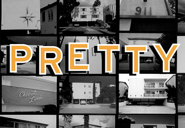
 Gallery: 1 2 3 4 5 6 7 8 9 10 from Pretty Vacant: The Los Angeles Dingbat Observed by Clive Piercy I moved to Los Angeles from London in 1982. Although I’d never been here before, the city was instantly familiar to me, for somewhere deep inside me lurked the spirit of Raymond Chandler and Nathanael West. Indeed, the biggest surprise to me, upon arrival was that the city existed in glorious full color and not in black and white, for my impressions of it had been formed from Billy Wilder films and Max Yavno photographs. I’d read Reyner Banham’s wonderful book Los Angeles: the Architecture of Four Ecologies and loved it, I think, because it took an outsider’s point of view, he being a fellow Brit. It’s funny how often an artist comes to a city from somewhere else and ends up representing that place more than a homegrown one does. In LA’s case that’s certainly true. David Hockney, from grim and grimy Bradford, and Ed Ruscha, from lonely Oklahoma, have become the quintessential Los Angeles artists. I’d coveted their work from afar, but having moved here, I quickly realized how vital their voices are to the character of this city. Banham’s enthusiastic, earthy prose, his interest in both high and low art, and the clarity of his vision struck a chord with this young graphic designer. A who’s-who list of modernist masters sprung from his pages, magical names?Gill, Wright, Schindler, Neutra, Lautner, Ellwood, Koenig, and Eames. I was eager to explore. And that’s the thing about LA — accessibility. Not a single one of my friends in England had lived in a house designed by Sir Christopher Wren or Sir John Vanbrugh, but here it was possible, through sheer proximity, to find yourself at a party given by a friend of a friend of a friend’s analyst’s nutritionist who just happened to live in a little gem of an early Neutra. I desperately needed somewhere to live. Trying to look as inconspicuous as possible in my Dodgers T-shirt and plastic Mickey Mouse ears, a partly-finished screenplay tossed casually on the backseat of my turquoise-and-white �59 Nash Metropolitan and (the Greatest Hits of) Christopher Cross blaring from the car radio, my wife and I began scouring the city for a suitable, (i.e., affordable) apartment. As we drove around our glamorous new town, I began to notice a certain type of apartment building that I’d not seen anywhere before. A purist International style fused with a generous helping of googie. Some of them bearing a more than passing resemblance to Le Corbusier’s Villa Savoye. Many of these structures sat precariously on rather thin stilts, a motley selection of Pintos, Chevettes, and Gremlins parked conveniently in the subterranean space below. It was the architect Francis Ventre, I think, who coined the term “dingbats” for them, but they all began life as variations on the modernist stucco box that had effectively replaced, through economic necessity and post war inventiveness, the Spanish colonial revival style that had dominated up until then. Structurally, that’s what they consist of: generic boxes on three sides with all of the attention paid to the street facades. Sets. All surface and no depth. How apt is that for LA, I hear you scream. But how inventive those facades turn out to be. Some display admirable restraint — almost austere in some ways — while most reflect the exuberant optimism and confidence that were sweeping the country, and especially California, in the period from 1945 through to the early sixties. They seem to complement the consumer objects of the day, much more closely than at other moments in history, with their vibrant, playful colors, organic-shaped details, and graphic patterns and textures afforded by the use of stucco. And at some point in the early fifties the garage doors disappeared from them, lightening the overall effect and making the carport and automobiles an integral part of the design. Was this because car design was going through its own creatively fertile period too? Or, more likely, owing to bureaucratic zoning restrictions? Not wishing to be outdone by their automobile counterparts, the stucco box designers adorned their buildings with an array of details. Many of them have names, proudly displayed in script type on the facade. Some appear to be directly named after a loved one, like Debby Den, while many others evoke glamorous destinations, often Polynesian. But where do you aspire to go when you already live in Paradise, albeit Paradise with a lobotomy? In many cases the street numbers are audaciously out of proportion with the rest of the facade and, of course, to a typographer, these are favorites of mine. And perhaps most recognizable of all are the innumerable versions of dingbat light fixtures that, at night, make the buildings twinkle and glow. Over the years I have documented these sadly beautiful buildings as I drove around Los Angeles, mostly from the driver’s side window of my car. These snapshots — for that is all they were ever intended to be — are an attempt at conveying the curious life stories of these buildings, without ever showing any of the inhabitants. Today, those original cars have been replaced with equally ridiculous sounding counterparts: RAVs, Echos, Integras and the saddest one of all, the Aspire. Parts of the name signage have dropped off, leaving us with tantalizing new ambiguities, so that “The Capri” has now become the much more contemporary-sounding “ he Cap .” And the street numbers have taken on a hardy patina. I return again and again to the same streets, just to make sure that these old friends of mine are still here, and I still feel a delicious sense of expectation when I turn onto a street and see an undiscovered dingbat in the distance. This is not a book about architecture — or photography. It is a visual poem, a love letter, and a simple attempt to help preserve these fantastic, quirky characters. |
| |
[ top ] ©2002 AIGA NY. All rights reserved. Want to reproduce something? Ask. |