


|
Abbott Miller: Interviewed John L. Walters, for Eye magazine 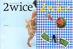
Excerpted from Eye No. 45 Vol. 12 John L. Walters: What was your take on the high/low divide? Abbott Miller: At high school, I was interested in the art-house fare of “Un Chien Andalou” and Cocteau; in college, it was on to more analytical stuff like Eisenstein, Vertov, Bresson, Stan Brakhage, and Godard. So I was aware of these layers of mass and avant-garde, but it was translated through one of the most accessible media possible. Eisenstein was radical form, born of a populist impulse. Later, Ellen [Lupton] and I wrote a catalogue essay on Andy Warhol, for a show curated by Donna de Salvo called Success is a Job in New York: The Early Art of Andy Warhol. Our essay considered the overlaps between his design and illustration careers and his entrée to the art world. Donna had interviewed art directors and colleagues who had worked with Warhol: in one tape the CBS art director Lou Dorfsman expressed amazement that Warhol had leveraged a design schtick into such a lofty place. For Dorfsman, it was no different than having a good concept and enough talent to execute it. In some ways the model of the designer works better to understand Warhol. It is strange to hear people from ‘high’ discourse on art consider the ‘low’ of mass-market design and media. You don’t really ‘decide’ to be influenced by commercial culture, you live and breathe it, and its effects are more inevitable, all-encompassing. And straightforward physical or technical issues are not familiar to art historians, and are overlooked. JLW: When it comes to design projects and clients, how ‘low’ could you go? AM: There really is no ‘too low’ for me! It’s more that I have a weakness for beauty and formal integrity that is sometimes irrelevant in the mass-market context. But I don’t see the pursuit of interesting and beautiful design as fundamentally at odds with the broadest possible marketplace. In that sense I am an optimist. I think we could all be more aware of the civility of design, of how design fosters meaning, interest, beauty. How design can be purposefully constructive in a poetic sense, not just like a sneeze of capitalist excess. JLW: Or are ‘beauty and formal integrity’ at odds with some mass-market products? For example, could you work with a fast-food chain or a reality TV show or for Hello! AM: I think there are forces that mitigate the strength of good design, and that the machinations that produce fast-food restaurants and Hello! involve so many people and so much fear that this is why good design is harder to find in those places. There isn’t an inherent opposition between good design and the mass-market, but you have to ask why it almost never happens. JLW: How do you choose fonts for your projects? AM: I am sometimes a very formalist designer, looking for metaphor and concept at every turn. In our early projects together, Ellen and I would squeeze every ounce of potential signification out of them. Now I’m more relaxed about stylistic issues. I have this period of my work I call ‘The Scala Years’. Ellen had done a show on Dutch design and she had introduced me to this font by Martin Majoor. When I first saw it I thought ‘big deal’, but when I started to work with it, it spawned endless uses. The Dance Ink years were the Scala Years: books, catalogues. Then I went on to Gerard Unger’s Swift. When I started 2wice I wanted the logo to be stable, but then I changed the body copy from Swift. Lately, the font choices have become more influenced by the spirit of the content. There is typically a display voice and a text voice, like in the John Lennon show, where large iconic numbers set in Burin Sans became like historical markers, but where the text face Avance became a more traditional reading font. I am a great admirer of typeface design, of the skill it requires, and of the subtlety it brings to the apprehension of content. A face like Avance is not something I would use frequently, but it was right for the Lennon show as a bookish font that had weight and integrity, but did not feel swallowed up by history. A typeface insinuates itself in the mix of signals, without being reducible to a specific ‘meaning’. Designers are usually bombarded by the specific, the literal, and typefaces are this territory of abstraction that can be very satisfying. I am not a type fetishist; I used Shattered in the Harley-Davidson show for an exhibit about rock and roll: the leather coats worn by AC/DC and guitars played by ZZ Top and other 1970s rock stuff, seemed to call out for Shattered. I used it in ten foot high letters, severely cropped. JLW: Thereęs nostalgia in your work for a lost era of American Modernism ă picnics and smart cars. AM: Yeah, I have a strong feeling for mid-century Modern. The most important design practitioners of the twentieth century were Charles and Ray Eames, and that nostalgia is there and that is me! JLW: There’s a tension between this pipe-smoking Modernism, with gleaming chrome in the kitchen and great chairs and Bernstein on the hi-fiÄand then thereęs the camp, slightly dangerous world of drag queens and Matthew BarneyÄthis other world, like “Pleasantville”Ätwo different eras leaking into each otherÄ AM: Well, I was really struck when I was working on the Barney book [Matthew Barney: The Cremaster Cycle, Guggenheim, 2002] how deeply influenced and referential the work is in the twentieth century design aesthetics. In a weird way, having Ray and Charles Eames on one side and Matthew Barney on the other I feel somewhere right in between. It’s partly that gesamtkunstwerk quality there is in Barney is also there in the Eameses. What are the connections between your designs for books and catalogues and for exhibitions? It’s sort of like a Lawrence Weiner statement: “words, images, and artifacts arranged on a wall, in space, or in a book.” That’s a simplification, but that is what is pleasurable to me: moments when the book and the three-dimensional experience feel the same (as in the John Lennon exhibition), but are done differently. It’s part of my ongoing love of moving between 2D and 3D contexts. JLW: Have you devised theories about organizing the exhibits in time and space? One reason I like exhibition design so much, is because there are no codified rules. It is not mature enough to have conventions that are established as those in print design. The practical issues of text size are really strongly related to the ethic I have about book and magazine typography. It’s just a different spatial issue of distance, and the fact that you are standing, not sitting. Your head is commanded to read from a certain distance and you are not so free to navigate as you are in book space. JLW: You have worked with some very original and creative clientsÄhas this resulted in some life-changing or opinion-changing experiences? AM: In working with other people as subjects, there is a real pleasure in working with people whose work you admire. I have designed a lot of books on dead men like Jerome Robbins, Ansel Adams, Antonin Artaud, Philippe Halsman, and Russel Wright. Itęs nicer to work with living subjects, and to have a real exchange. This has happened with artists such as Hans Haacke, Barbara Bloom, Nam Jun Paik, Yoko Ono, John Kelley, Matthew Barney and right now, Liz Diller and Rick Scofidio. You immerse yourself and develop a fast and deep expertise that you can act upon. No matter how dynamic it can be, it does remain at the level of a service though. The paradigm has to change so I can become a more active agent. Each new product holds so much interest that you get completely wrapped up in it, Then you stand back and say, “you mean we did all that and all we get is a design credit!” Of course, you get the cash, too, but that’s very parenthetical. It’s all about the projects and the opportunities and for me and most designers I know — you’d rather have great work than lots of money. It is fascinating to work with people on books about their work, because everyone realizes the relative permanence of a book. It establishes the story unlike any other kind of document, and it also makes book making sometimes very emotional and volatile. Subjects become vulnerable as they become books. When you have the opportunity to meet, discuss, and test your assumptions against your subjects, you can get real, visceral reactions. One of the best parts is entering the work spaces of these people, seeing how everyday work is conducted, the texture of their daily lives in their studios. Matthew Barney’s studio is like a very dense hive of fabrication, Nam June Paik’s studio was messy and Barbara Bloom works in a writerly studio filled with books and files. The culture people build in their studios is indicative of their work. Is it conversational? Is it frantic? Is it dictatorial? Is it contemplative? I feel that I cultivated a great studio climate at Design/Writing/Research, which is an ideal that I strive for now. It’s harder as I get older (I am 39 now) to converse with my students as a peer, or to keep the relationships in the studio seeming as balanced as when you are only five or six years older than the people you work with. Related links www.eyemagazine.com www.2wice.org |
| |
[ top ] ©2002 AIGA NY. All rights reserved. Want to reproduce something? Ask. |