|
As a founder of the design collective Grapus, Pierre Bernard fought theidea that culture is elitist, that unionism is out of fashion and that politics are dirty and useless. Now Pierre and his studio Atelier de Creation Graphique apply the same philosophy to professional graphic design. His inspiring lecture "Be Realistic, Demand the Impossible" was one of the highlights of the 2000-2001 AIGA NY season.
by Veronique Vienne
Under the cobblestones, you will find the beach," promised graffiti encouraging students to tear up the pavement to build barricades during the May 1968 Paris uprising. Twenty-two years later, Pierre Bernard discovered under some of Paris's oldest cobblestones not a beach, but a sky. He came upon it by chance when standing in front of I.M. Pei's pyramid entrance to the Louvre museum. There it was a huge rectangle of shimmering sunlight and drifting clouds unearthed right under the pavement of the Cour Napoleon. "Under the Pyramid, I found a patch of Parisian sky," he says. Through the skylight, the sunken lobby reflected the open space that stretches in a majestic East-West perspective over the Tuileries gardens, "I realized that the Louvre was no longer a dark and gloomy museum. It had become the lieu du ciel, the residence of the sky."
Asked by the administration of the Louvre to create the graphic
identity for the newly renovated museum, Bernard, one of the
founders of the celebrated Grapus design collective, boldly
decided to eschew the conventional imagery usually associated
with museums (columns, statues, classical details, etc.) and
to incorporate into the logotype a wispy patch of sky. White
letters float on a black rectangle rendered transparent by the
hazy presence of a cluster of stray clouds. On this diaphanous
backdrop, the word "Louvre" looks deliciously surreal,
suggesting evasion rather than permanence. "I didn't want
to support the cliché that the Louvre was a place of
order, reverence, and boredom," says fifty-six-year-old
Bernard, "At the same time, I wanted to claim the wealth
of the museum as the property of the French people, not the
property of a cultural elite."
"an image has to go through the filter
of your personal experience and inner convictions"
Although he is a former member of the Communist party, this
is not strident leftist rhetoric. Bernard's approach to graphic
design is more artistically than politically driven. Greatly
influenced by legendary Polish poster artist Henryk Tomaszewski,
with whom he studied in Warsaw in the mid-1960's, Bernard believes
that "in order to touch the viewer, an image has to go
through the filter of your personal experience and inner convictions.
Il faut s'approprier le message. You must make the message your
own." Amazingly, Bernard's very personal interpretation
of the Louvre museum as a "residence of the sky" was
accepted. This could only happen in France, a country where
philosophical argument wins out over common sense, where a client
is likely to ask a designer: "Your design solution works
on a practical level, but does it work on a theoretical one?"
This ability of the French to rationalize everything--even their
most poetic impulses-- is unique in the world. "They ask
ë why' all the time," says American designer Ken Carbone,
whose New York-based office, Carbone Smolan Associates, was
asked to handle the architectural signage of the Louvre before
Bernard was selected to design the graphic identity of the museum
( a typically French, bureaucratically-correct, illogical procedure).
"You are guilty until proven innocent," adds Carbone.
"Whereas in the United States the client-designer relationship
is based on trust, in France it's based on presenting evidence."
The Louvre assignment was a turning point in Bernard's career. His fellow designers at Grapus believed the collective should turn down the job. "We used to argue all the time about who we should work for," he says. "Unlike other members of the group who only wanted to design for political causes, I believed that graphic communication could be an instrument of social change when applied to cultural institutions and so, in 1991, I went my way and formed the ACG, short for Atelier de Creation Graphique. The Grapus collective, founded in 1970 by Bernard, Gerard Paris-Clavel, and Francois Miche in the aftermath of May 1968, had started to unravel in 1985 when it won the competition to design the graphic identity for the park and museum complex of La Villette, an ambitous urban renovation project in the northeastern corner of Paris. For fifteen years, the left-wing radical studio had created some of the most meaningful cultural icons of the time. Their posters, handouts and even bumper stickers recklessly combined collages and graffiti using a technique of visual disruption known as detournement, the rerouting of a message through acts of visual vandalism. An attempt to "organize chaos," this graphic language was perfected by the Situationnistes Internationaux (SI), the anarchist group of art students that masterminded the cultural explosion in May 1968. That's why the Villette project, sponsored by the government, generated tensions within the Grapus collective. Some of the members became weary of the cultural and possibly elitist nature of the assignment. The logotype they designed reflects this ambivalence: a playful Bauhaus pastiche incorporating a triangle, a square, and a circle. It looks deliberately naive.
"Grapus could have asked for anything
they wanted"
The 1980's were a time of cultural euphoria in socialist France. Jack Lang, minister of culture, supported a wide range of avant-garde art projects, and graphic expression was one of them. Every socialist city, town and village had to have its logo. All the government agencies felt compelled to acquire a graphic identity. And the Georges Pompidou Center had just mounted an exhibition called Images d'utilite publique (Images for Public Use) that defined, for the first time, the role of graphic design in modern democracies. Most important for French Designers, a coherent graphic design theory was beginning to emerge. But instead of helping Grapus mainstream its revolutionary message, this sudden surge of public interest in graphic design challenged their very raison d'etre. No longer in the opposition, the members of the collective felt that they were betraying their subversive mission. Like the SI, who disappeared as a group in the confusion of the student uprising they had fostered, Grapus dissolved when it's confrontational ideology was successfully co-opted by the cultural establishment. "Grapus could have asked for anything they wanted," says Marc GobÈ, a successful design consultancy with offices in Paris and New York. "They could have asked for a lot of money. They could do no wrong. Everybody wanted to work with them. But instead they splintered and fell apart."
Today, the members of the Grapus collective are practicing their craft, each on their own terms. None have sold out. Paris Clavel designs award-winning, leftist posters under the Ne pas plier monkier (a pun on the "Do Not Fold" warning on mailing envelopes containing graphic material, the name suggests an inflexible state of mind), Miche teaches at the Ecole de Arts DÈcoratifs. Alex Jordan, who had joined Grapus in 1976, formed Nous travaillons ensemble (We Work Together), another design collective known for it's social involvement. Fokke Draaijer and Dirk Debage, two Dutch graphic designers who stayed on with Pierre Bernard to form ACG, also eventually left to create their own studios.
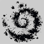
"Sharing work was an important part of the Grapus experience," explains Bernard. "Now I am alone, and it's a new thing altogether." Three graphic designers, Uli Meisenheimer, Johannes Bergerhausen, and Cyril Cohen, work for him. "The new generation is respectful of its elders," he notes, "they don't argue with me, I miss the friendly confrontations. I miss embracing another person's perspective as my own." Bernard has managed to keep his social commitment alive while keeping busy at the same time, an act of defiance in today's bottom-line-obsessed economic climate. One of his most ambitious ongoing projects is the graphic identity program for the Pares Nationaux de France (French National Parks). His design solution is typically playful: the symbol for the organization is a spiral made of a cluster of overlapping silhouettes of animals and plants. It incorporates every species of fauna and flora thriving in the seven-park nature preserve. Barely identifiable on letterheads and business cards, the tiny silhouettes, everything from a silver fir to a silver fox, come into focus, fractal-style, as the scale is enlarged. The more you scrutinize the fuzzy logotype, the more fun it gets. Birds, bugs, and beasts seem to crawl out of its leafy outline. Here again, the mischievous and festive spirit of May 1968 prevails. "We used to mix politics and pleasure," explains Bernard. "There is no reason why high-spirited things can't serve a political or social cause. Enjoyment doesn't cost more money!"
"His work has an honest edge, but it's not edgy."
Whether it's a poster for an avant-garde theatre, book covers for an alternative publisher, a signage system for the Pompidou museum, a conference announcement for the Organisation Mondiale de la Santé (OMS), or a logo for the suburban city of Ivry, all the ACG projects benefit from Bernard's assumption that graphic solutions must be emotionally exhilarating in order to be intellectually stimulating. His insistence on using poetic license whenever possible, a skill he says he learned in Warsaw, never ceases to amaze his peers on either side of the Atlantic. "Pierre has been a beacon," says British designer Alan Fletcher, one of the founders of Pentagram, who often competed with Bernard on international projects. "I am totally envious of his lack of inhibitions. In Fact, it's quite intimidating. His work comes straight from the heart." Ken Carbone, who was on the jury that selected Bernard for the Louvre project, comments: "His work has an honest edge, but it's not edgy." Most graphic designers do pro-bono work in their spare time. Understandably, they show polite reverence for people like Bernard who chose to work full time for cultural institutions and non-profit organizations and ignore big-budget corporate assignments. "Pierre could make a lot of money," says Pierre di Sciullo, a French typographer who sometimes collaborates with Bernard. "But he chooses to be a graphic designer, not a businessman. He made a conscious decision not to turn his passion into a money-making venture." Always generous--Bernard doesn't skimp on salaries and pays his employees for working one day a week on personal projects--he stubbornly believes that good graphic design can pay the bills while bringing about social change.
Americans, particularly if they work for advocacy groups, are bewildered by Bernard's artistic approach. "French posters designed by artists with a social agenda are very pretty," says Herbert Chao Gunther, executive director and president of Public Media Center (PMC), an alternative advertising agency in San Francisco. "They are suitable for framing, but they attract too much attention to themselves. At PMC, we want to make people think. The idea has to be more interesting than the presentation." Bernard disagrees categorically. "My work is effective when it generates an emotion that creates a necessity to think," he says. "The intellectual effort and the need to reflect on an issue come in response to a feeling not a thought."
"Graphic design's role is not to excite
economic growth."
Needless to say, Pierre Bernard doesn't believe in focus groups and marketing projections. As a result, ACG never gets calls from advertising agencies. "I would be surprised if they did [call]." Says Bernard. "I always made it know that I resent the ideological influence of advertising on graphic design. Graphic design's role is not to excite economic growth." Distrust of advertising and its propaganda techniques is widespread among French graphic designers. More artists than marketers, they turn pugnacious if you suggest what's obvious to American designers--that packaging or branding are a subset of graphic design. A logo on a tee-shirt? An advertising slogan on a mug? A brand name on a tote bag? Quel horreur!
"France has a cultural hang-up," says Fletcher, "Commercial designers are second-class citizens behind fine artists. It's a society in which the chic thing is to get a painter to design your wine label. As a result, France is a huge country with a disproportionately low ratio of good graphic designers." Influenced by Swiss, Dutch, Polish, German and American graphic design, France lags behind, with no clearly defined contribution to the field. "We are a sad exception in Europe." Agrees Michel Wlassikoff, editor-in-chief of the magazine Signes, one of the few French publications on the subject. "Graphic design and advertising are two different realms. Few designers can cross over."
For the Ecole Supèrieure des Arts Décoratifs de Strasbourg, Wlassikoff is researching the source of the Gallic Graphic design malaise. So far, his research has yielded a troubling insight. "The French are instinctively weary of graphic design because they were subjected to high levels of propaganda-driven graphic design during the German occupation between 1940 and1945," he explains. "Unlike other occupied countries, France was a laboratory where Nazis officially tested their theories of world domination through visual propaganda. "Posters printed by the Vichy government added to the climate of indoctrination. For French citizens, tearing down posters or defacing them was often the only form of resistance. "This could also explain why the French are erratic typographers," adds Wlassikoff, "Subconsciously, they associate sans serifs typography, preferred by Nazi designers for its clarity, with cultural oppression."
Wlassikoff believes in the redemptive properties of historical analysis. He and Pierre Bernard have long discussions on the topic. But for Bernard, solutions are not found in the past but the future. He works tirelessly to develop long-term projects and also long-term clients. More profitable than simply chasing after the next job, he figures, is educating the next generation of graphic design users. A teacher at the Ecole des Arts DÈcoratifs, he is also a mentor for peers and clients. "Pierre's greatest talent is to convince people who hire him that their projects have immense potential," says di Sciullo. Three decades after the student uprising, the spirit of May 1968 still resonates. Echoing the most famous slogan of that period--Be Realistic. Demand the Impossible--Pierre Bernard labors to make sure that there will always be room in French culture for both politics and pleasure.
This article originally appeared in Graphis magazine and is reproduced here with the kind permission of the author. |
|
|
|